You might remember that the mighty Genie in the movie Alladin lived in a teeny little space. This phrase seemed to fit the subject today. Mini Books. Have you noticed that people will pick these up and look at them more readily than they will pick up your larger photo album? I have also found it fun to have a small album of a specific event or trip even though I might have it recorded in a larger album too.
Some folks just whip out a mini book in no time. Others struggle with making one. Thought I'd share a couple of ideas we used in a book and maybe they will be of use for your next book!
This is the Maya Road album that is approximately 4 x 4 inches overall, the pages are about 3 x 3 in size. I think that a tendency in these smaller books is to only use small prints. There is certainly nothing wrong in that, but thought this might give you a variation. Here we have used the 4 x 6 and 3.5 x 5 inch size prints for the book.
As you can see in the photo above. the entire page is covered with a print. This focuses on the subject, who happens to be large and center in the photo. Since not all of your photos have the subject so perfectly placed, there are a couple of other ideas within the book.
The photo on the right sided page has been torn to give some interest to the page. The tearing worked well for the beach shot-fitting in with the waves and sandy look of the original photo. We could also add a stamp which could have been journaling just as easily.
Again, in this view, one page is the full photo. The other page (left side) is just paper. A stamp was used for the quote and the sea shells, picking up on the mood of the day and the photo used on the right sided page.
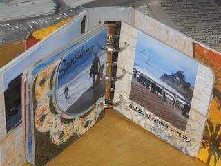
On this last example, neither of the photos are kept in their full size. Cropping the photos with your scissors allows you to get the larger photos in the book while keeping the focus of the picture. These two pages just give other examples of using the paper with the photos for interest.
Hope this sparked a new thought for you. Would love to see some of the books you do. If you are interested in more on this book, it is at the store on display. Thanks.
Thursday, February 25, 2010
Saturday, February 13, 2010
Super Fun Layouts!
Gena has done such a great job on these layouts. I love the way she has focused our eyes on the photos in each. They tell a story even without the words. The words provide an additional piece of the story though.
Strips of paper are so sharp looking on the page. A great way to use just a smidge of favorite papers or perhaps to use up some scraps.
Don't you love the layered circle on this layout? Thanks for doing these for us Gena!
Strips of paper are so sharp looking on the page. A great way to use just a smidge of favorite papers or perhaps to use up some scraps.
Don't you love the layered circle on this layout? Thanks for doing these for us Gena!
Sunday, February 7, 2010
Promises of Spring
Even though the groundhog saw his shadow, we know Spring is coming. Despite the cold days right now, I look forward to the flowers and birds of Spring.
I really think that Dee Dee captured the feeling of Spring in this banner. She started with the Maya Road flower album, the Maya Road Canvas banner (brand new this month). She painted the flowers a soft green then sanded the edges. Applied a lot of beautiful layers of flowers, brads, stickers, made little pinwheels of paper, painted and glittered the chipboard alphabet. Strung on lovely ribbons with soft bows, it pulls together perfectly.
Clicking on the picture will enlarge it if you want to see it in more detail.
Wednesday, February 3, 2010
Continual Inspiration
A yearly event is the Ranger Challenge Wall at CHA. This year, the challenge was to use the melting pot with UTEE and the ticket. This is a picture of the wall. WOnderful results and all so different. Although two of the appear to have popcorn on them, it is UTEE, not real food.
Suze Weinberg is the genius behind the melting pot art. Check out her blog for close ups and more info.
On the store blog, there is a contest/challenge going on. Be sure to take a look and leave comments for a chance to win a prize.
Sunday, January 24, 2010
Non-Scrapbook Inspiration
Keeping an Eye Out for Inspiration
I appreciate so many decorative endeavors. You can imagine that there are a lot of creative people here at CHA. I am always amazed when someone takes a skill and does something unexpected with it.
I hope to share more of these with you, but had to post this one for you today. Check out these balloon flowers. So bright and cheerful. I thought they were quite cute. They are being used as a divider between an aisle and a crafting area. Practical and yet provide a diversion for the eye.
Tuesday, January 5, 2010
Design Challenges
As we start this new year, I'm curious. What sort of things challenge you? Color matching, titles, perfect embellishments....etc.
Maybe challenge is too strong of a word, but I think you know what I mean. What part of the page or project do you focus on, and fixate on until it is "right"?
Anxiously awaiting your responses. Later!
Subscribe to:
Posts (Atom)